Taking friction out of one of the world’s largest restaurant apps.
A major redesign of Subway’s ordering experience during a broader product transformation. I worked on the mobile build-your-sandwich flow and the web checkout, the two places people were quietly giving up.
1★ → 4.5★ App Store rating
Role
UX Designer, at Agilitee
Focus
Build-your-sandwich flow Web checkout
Outcome
Higher checkout completion 1★ to 4.5★ App Store rating
01
The app worked. People still didn’t finish their orders.
Ordering a sandwich should be one of the easier things a person does on a phone. In practice, customizing one meant moving through a long sequence of screens, each asking about a single category, with no clear sense of how much further there was to go.
Checkout on web had a similar shape: everything present, nothing prioritized. Deals, rewards, promo codes, upsells, and the order itself were all competing for the same attention at the moment people were trying to pay.
Neither was broken. Both were exhausting.
02
The work.
Analyze where people dropped, simplify the sandwich-building steps, and give the order back its place at the center of checkout.
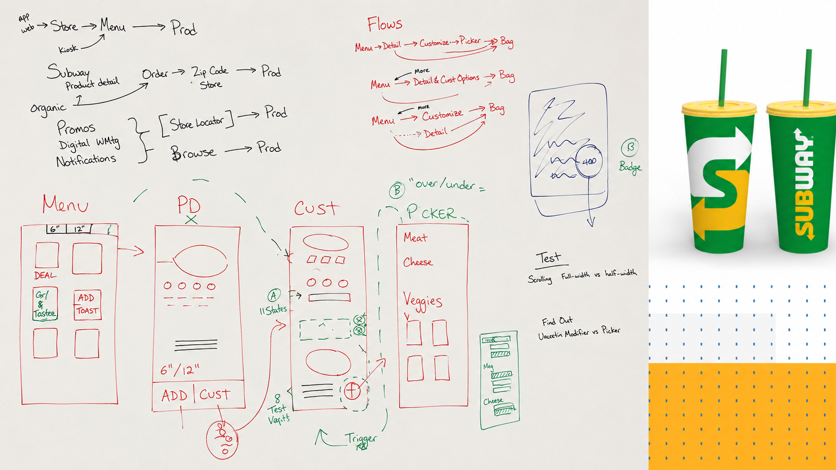
Exploration for the mobile customization flow. The annotations are the interesting part: each one is a decision about what to remove, and why.
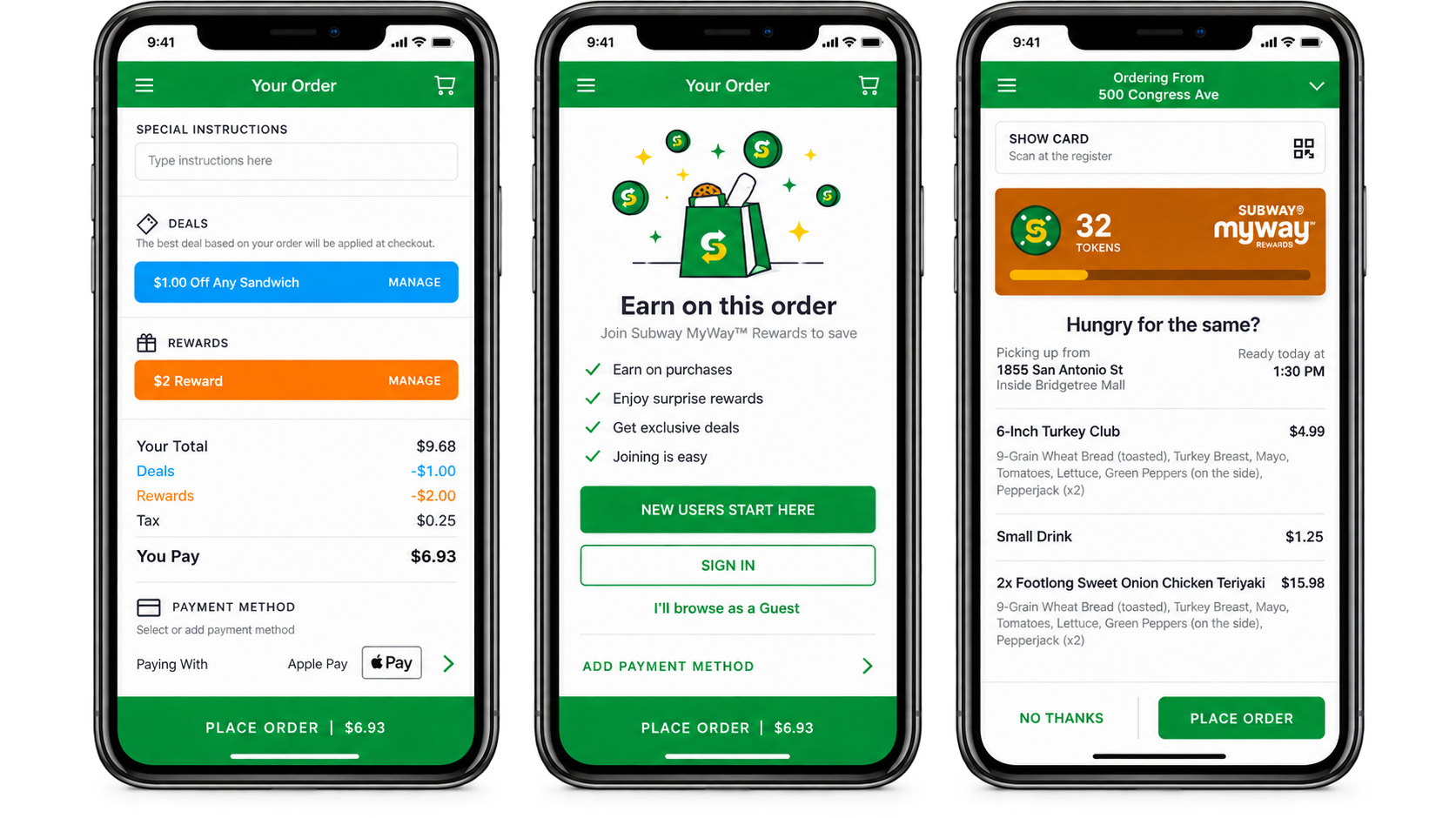
The shipped mobile moments: order review with deals and rewards stacked against the total, the rewards decision at the point of payment, and the order summary carrying pickup details and MyWay tokens.
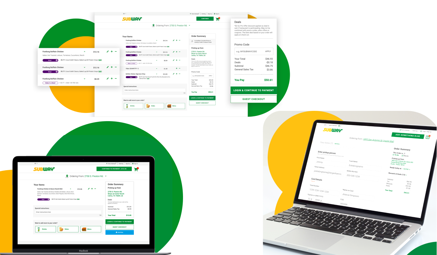
Checkout process on desktop.
Other design exploration for the sandwich builder that we didn’t go with.
03
Three product decisions.
Decision 01
Stop asking one question per screen.
Customization was a sequence. We grouped it so people could see and select toppings in place, with multi-select, instead of advancing through a category at a time. Fewer screens between wanting a sandwich and having one.
A step is not free just because it is simple.
Decision 02
Remove the choices that weren’t choices.
Some screens asked people to pick things they could not actually change at that point. Every one of those is a small tax: read, understand, realize it does not apply, move on. We took them out.
The cheapest interaction to improve is the one you delete.
Decision 03
Let checkout be about checking out.
Deals, rewards, and promo codes all belong in checkout. They do not all belong at the same weight. We gave the order and the total the primary position, and kept savings visible without letting them argue with the button.
Everything important is not the same as everything first.
The redesign shipped into a broader transformation.The App Store rating went from one star to 4.5.
Ratings are a blunt instrument, and plenty of people worked on that number. But the direction of travel was clear, and checkout completion moved with it.
04
What I learned.
At this scale, the wins are not clever. They are subtraction, done carefully, in the two or three places where the most people are standing.
I also learned to be suspicious of flows that look reasonable on a whiteboard. On a whiteboard, eleven steps is a tidy diagram. On a phone, in a parking lot, at lunch, it is a reason to close the app.
Working the flows out by hand. Exactly the kind of tidy diagram that looks fine on a wall and falls apart on a phone.