19 properties.Two audiences.Nineteen different headers.One shell had to work for all of them.
Optum runs 19 separate customer-facing properties across two audiences. Each grew on its own timeline, with its own header, footer, sign-in, and information architecture. Meanwhile four initiatives (mega-nav updates, the AI Marketplace, Optum AI, and a platform migration) were all touching navigation at once, without a shared model between them.
What sounded like a navigation redesign was really a much bigger systems problem.
How do you create one shared experience without forcing nineteen very different properties into the exact same box?
Discovery and Propose complete. Directional options and governance model delivered. Not live when I left.
01 The real problem
The visible problem was the menu.The real problem was fragmentation.
Different product teams had solved navigation in different ways.
Some products had multiple rows of navigation. Others had deeply nested menus. Some needed access to several Optum products, while others had highly specialized workflows.
Individually, many of those decisions made sense. Together, they created a fragmented ecosystem.
Users had to relearn navigation as they moved between products. Teams were solving the same problems repeatedly. Valuable screen space was disappearing under layers of navigation. And there was no shared pattern that could scale across the portfolio.
Notice band plus 2 bandsFully inverted, blackCart in the navOutline CTA, not filledIts own accent mark
Seven Optum properties, rebuilt in HTML from the live sites. Click through them. Every one of these was a reasonable decision by a capable team. Nothing here is wrong. There was just nothing telling any of them what was shared.
What the audit actually found
16/103
Optum for Business nav links pointing to a different domain. Twelve of the sixteen sat three levels deep.
10/27
On Optum Personal. Half of them at the top level, half buried two levels down.
5/200
AI Marketplace. Two hundred nav links, and only five of them leave the property.
5+
Separate sign-in portals scattered across the Business navigation. Users re-authenticated two or three times inside a single task.
Five properties audited link by link. The counts mattered less than the shape they revealed: cross-property movement existed everywhere, was inconsistently placed, and nobody owned it.
The sign-in fragmentation was the finding that changed the conversation.
On the Business side, login was spread across five or more portals reached from different points in the nav. On the Personal side, the sign-in dropdown offered four audience buckets (individuals and families, providers and organizations, employers, brokers) which directly contradicted the Personal and Business split sitting one level above it.
So the same user was being asked to declare who they were twice, in two different vocabularies, and the answers did not match.
We didn’t need a prettier menu. We needed a system.
02 Discovery
Before designing anything, I needed to understand what couldn’t break.
This was not a project where I could disappear into Figma for a week and come back with a clever solution.
There were too many products, teams, users, technical constraints, and legitimate exceptions.
So I started by listening.
I worked across product, design, engineering, and business teams to understand how navigation was being used today and what each product actually needed from a global system.
The interesting part was separating:
“We’ve always done it this way.”
from:
“Our users genuinely need this.”
What was truly global?
What needed to stay local?
What were users trying to move between?
Where were we creating unnecessary complexity?
What could engineering realistically support?
Four phases, sequenced so each one earns the next
01
Align
Convene the working group. One problem statement, one scope, agreed success criteria.
Where we were
02
Map
Current-state journeys across properties. Surface every continuity gap and every repeated pattern.
Next
03
Propose
Directional concepts, IA rules, and the governance model.
Next
04
Handoff
Journey-driven requirements to Product and Engineering for design and build.
Later
What this work was
Aligning stakeholders on a shared nav model
Mapping current-state cross-site journeys
Documenting handoffs and continuity gaps
Capability-level requirements drawn from real journeys
The governance model that makes future decisions stick
What it was not
Visual or interaction design
Component or UI design
Technical implementation
Platform audits
Product or business decision-making
Being explicit about the second column mattered as much as the first. On a project this visible, everyone arrives with something they hope you are also solving.
03 The uncomfortable question
How much flexibility can you allow before a standard stops being a standard?
Make the system too rigid and products with complex requirements can’t use it.
Make it too flexible and every team customizes it until you’re right back where you started.
So instead of trying to design a navigation that handled every possible scenario, I focused on defining a stable global layer with intentional flexibility underneath it.
We weren’t designing one giant navigation to contain everything. We were defining what belonged to the Optum ecosystem and what belonged to the individual product.
04 Principles
Six rules, written down before any wireframe.
Not a values slide. Each one exists to settle an argument I knew was coming, so the argument could be settled once instead of nineteen times.
1One shell, many properties
The global nav is a shared shell. Property teams own the content inside it, within the contract.
2Audience over sub-brand
Personal and Business is the primary wayfinding signal, not the product name. It lives at the top level.
3Accessibility is the floor
WCAG 2.2 AA minimum. No product exception overrides accessibility. Ever.
4Authorable or it does not exist
Every pattern has to be authorable in the CMS. If content authors cannot use it, we cannot govern it, so it will drift.
5Context should persist
Audience, sign-in, and task state survive movement between properties. This is the whole point.
6Fewer, better choices
Cap primary navigation at five to seven items. Use depth for density, never breadth.
The fourth one saved the most time. A pattern nobody can author is a pattern that quietly forks.
05 From requirements to a pattern
19 properties, hundreds of nav links, one shared shell.
19 Optum properties
↓
User needsBusiness requirementsExisting patternsTechnical constraintsAccessibilityProduct exceptions
↓
Patterns
↓
Shared requirements
↓
Global navigation system
My job wasn’t to make 19 properties identical. It was to find the part they could share.
06 Precedent
Other people have already had this problem.
Five multi-property companies solving audience-specific navigation at scale. I was looking for what to borrow and, more usefully, what it cost them.
Company
Pattern
What it does
What it told us
Salesforce
App Launcher
A grid icon surfaces the seven most-used apps, with View All for the full catalogue. Visibility is permission-based, so users only see what their role unlocks.
Precedent for a launcher. Reduces load, allows user-controlled ordering.
Microsoft Dynamics
Persona-mapped nav
Role-to-persona mapping auto-configures the sidebar per user. Batch configurable for enterprise scale.
Validates an audience toggle. Assign the persona once, let nav adapt.
Cisco
Cross-platform navigator
One login across four products. Shared header, and feature navigation that compares across them.
Closest model to ours. Federated header plus single sign-on across all 19 properties.
AWS
Multi-account role switching
Up to five identities in one browser, with colour cues and history. Switcher lives top right.
Power-user pattern for people who genuinely need both Personal and Business at once.
Epic and Cerner
Role-segregated portals
Patient portal and provider portal are separate products. Different terminology, workflows, and navigation over the same data.
Healthcare precedent for splitting. Separate structures when audience goals differ fundamentally.
The finding that argued against us
Segmenting a site’s navigation by audience often degrades usability, because users belong to more than one category, or cannot tell which one they are.
That is Nielsen Norman Group, and it points directly at the audience toggle sitting at the centre of our leading direction.
I put it in the deck rather than leaving it out. It reframed the toggle from a settled decision into a thing we had to earn: it only works if the two audiences have genuinely different goals, if the labels are unmistakable, and if choosing wrong is cheap to undo. Our audit supported the first. The other two became requirements.
07 Header studies
First I tested how much a single band could carry.
Before the three strategic models, a narrower question: how much can one header hold before it stops working? Rebuilt in HTML from my own exploration files. Same structure, same content, redrawn rather than screenshotted.
Three stacked bands before a user reaches any content: an audience strip, a brand and utility row, then the product nav. Every band is defensible on its own. Together they take a fixed slice off the top of 130 properties.
01 Strip it to almost nothing
Optum
Sign in
Borrowed from a pattern I had been studying. Brand, a switcher, and one action. It gives nearly all the vertical space back.
It also gives up wayfinding entirely. Users could no longer see where they were or what else existed.
PersonalBusiness All sites SearchSign in SupportGet in touch
The move that resolved it: stop making the ecosystem and the product compete for the same horizontal band. Product navigation sits left, in the reading position, and can grow. The global layer becomes its own cluster: audience toggle, all sites, search, sign in, support, and the action. Two owners, two regions, one row of height.
One ecosystem on top. Product flexibility underneath.
08 Three directions
Three models, costed honestly.
Not three visual treatments of one idea. Three different answers to where cross-property movement should live, each with a different governance bill attached. Rebuilt here in HTML from the wireframes.
Option A Personal and Business mega nav
Leads with the audience split that already exists. The mega menu swaps entirely on toggle.
①The audience toggle persists across all 19 properties via a shared cookie. Today the Personal site exposes four sub-audiences in its sign-in dropdown. This consolidates to the binary.
②A sub-brand lockup carries the property name. The utility bar standardises the sixteen Business links that currently point off-domain from wherever they happen to sit.
③The mega IA runs by-need, then who we help, then sister-site quick links, then featured. The audit found twelve of sixteen cross-domain links sitting three levels deep today.
④The dead-end "All Optum sites" page becomes an inline dropdown grouped by audience.
Lowest change cost, because it extends what teams already understand. Also the least ambitious, and it inherits the audience-segmentation risk the research warns about.
Option B Cross-site app switcher
Treats the properties as an ecosystem of applications, with a launcher to move between them.
Optum StoreOptum RxOptum PerksLive and Work WellOptum Behavioral CareOptum BankOptum AIOptum AI MarketplaceHospice PharmacyLearning CommunitySubrogation ReferralWebAssist Phys HealthWorkers’ Comp & AutoOptum360Optum360 CodingOptumHealth EducationOptum Rx HCPProvider ExpressProvider Credentialing
Peach: Personal sites. White: Business and professional sites. All 19 destinations in one launcher.
①The grid icon is a universally understood apps affordance with an established ARIA menu role. It houses all 19 destinations.
②It decouples every property below the shell, so each can evolve its own IA without breaking anything. AI Marketplace has 200 nav links and only five cross-domain, and this pattern contains that comfortably.
③The tradeoff: a user who never opens the launcher never discovers cross-property journeys at all. Content has to cross-link to compensate.
④Best fit for authenticated returning users, and it consolidates the five-plus sign-in portals the Business side currently scatters.
The cleanest separation of concerns, and the biggest bet on discoverability. Strong for signed-in users, weak for first visits.
Option C Hybrid with contextual sticky nav
Audience toggle, launcher, and a page-scoped sticky bar for long pages. Most flexible, most to govern.
Long-form content. The sticky bar collapses the primary nav on scroll.
①Toggle, utility, and launcher stack at the top. The sticky adds a page-scoped bar on pages over roughly 1500 pixels or with three or more sections.
②The sticky is authored as a component with fixed slots: breadcrumb, section nav, one CTA. Nothing else fits in it, deliberately.
③Respects reduced-motion, exposes the current section to assistive tech, keeps 44 pixel targets. WCAG 2.2 AA.
④Highest governance burden, so it is scoped only to properties the audit showed have genuinely deep structure.
The most capable and the most expensive to police. Recommended as a scoped addition to A or B, never as the default.
Every option was buildable. They just cost different amounts to keep honest.
09 Gaps
Nine places the journey broke.
Each of these left discovery as a written requirement handed to Product and Engineering, not as an observation in a deck.
G1
Audience context does not persist
The Personal sign-in offers four sub-audiences, which contradicts the Personal and Business toggle one level above it.
G2
No cross-site session
Login is scattered across five or more Business portals. Users re-authenticate two or three times inside a single task.
G3
Inconsistent header anatomy
Business has 16 of 103 links pointing off-domain, Personal has 10 of 27, and the same utility items live in different places on each property.
G4
All Optum sites is a dead end
It forces users off-site to find their next destination. Flagged as the primary context break on every property audited.
G5
Footer IA varies per property
The legal row is consistent. Everything above it has no shared taxonomy.
G6
Search scope is ambiguous
Is search site-only or ecosystem-wide? There is no signal to the user either way.
G7
Sign-in model mismatch
The Personal dropdown links to Business sign-in paths, mixing audiences inside one property.
G8
Mobile drawer varies
The audience toggle moves, or is missing entirely. One property has no toggle at all.
G9
Analytics cannot stitch journeys
Cross-property paths are untrackable, so nobody could prove how often this was actually happening.
G9 is the one I would fight for first.
Without cross-property analytics, every conversation about this work runs on conviction. You cannot show how many people are making these journeys, so you cannot price the fix, and a project with no price is a project that gets deferred.
10 The solution
The solution wasn’t really a menu.It was a contract between the ecosystem and the product.
The global navigation establishes the shared Optum layer. It gives users a consistent way to understand where they are, move across the ecosystem, and access common destinations without consuming the space individual products need for their own work.
Underneath that layer, products retain the flexibility to support their specific workflows.
That separation was the key. It gave us consistency without pretending every Optum product was the same.
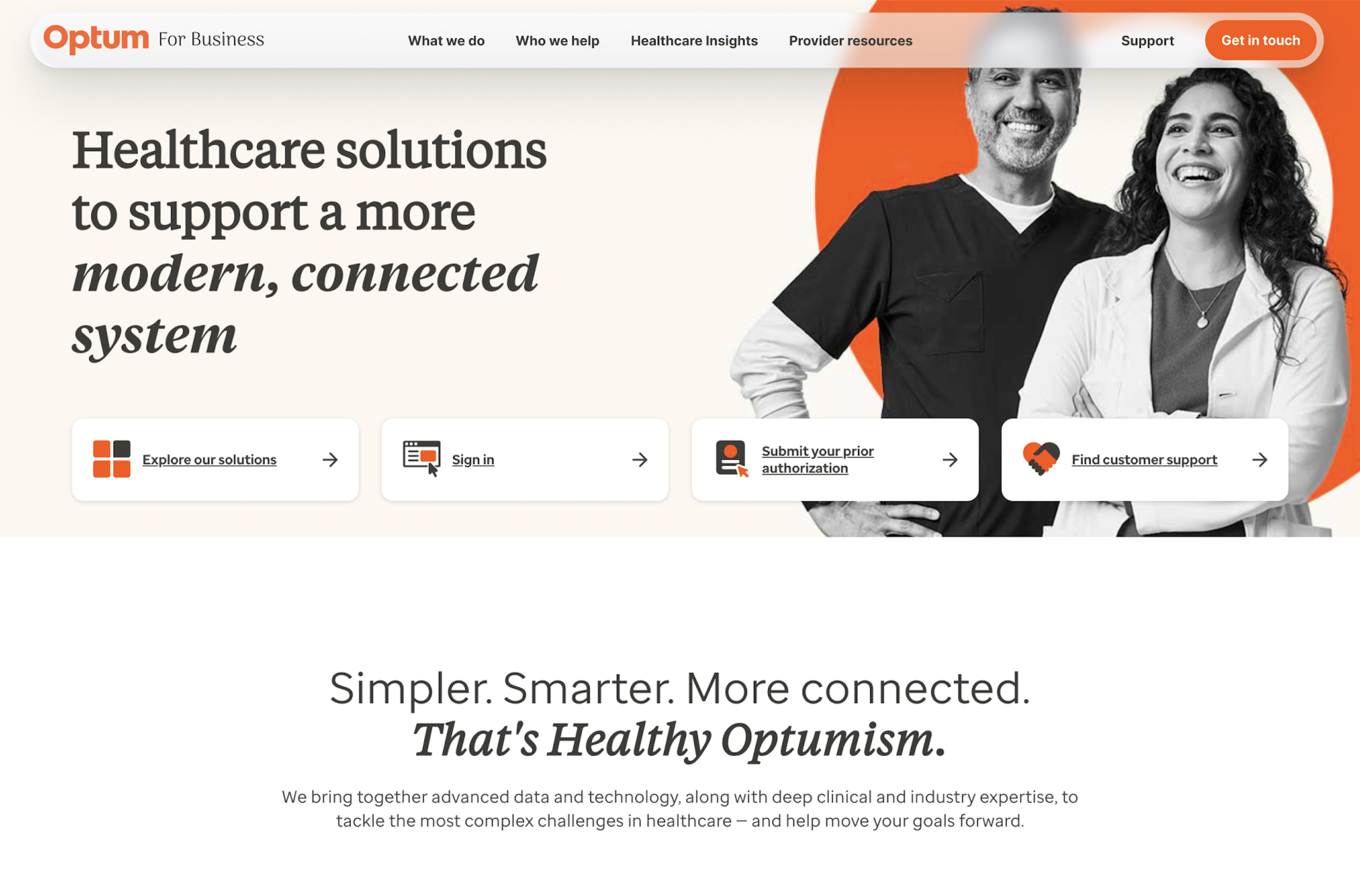
Healthcare solutions to support a more modern, connected system
The last mock I made. Three stacked bands became one floating shell that sits over the page rather than pushing it down. The audience toggle moved out of the permanent header and into the launcher, the utility row collapsed into a single Support link, and the primary action took the brand colour so it reads as the one thing to do. Everything a product team owns starts immediately underneath.
Three bands to one
A fixed slice of every page came back to the property. On long enterprise pages that is the difference between content starting above the fold and below it.
It floats, it does not stack
Sitting over the hero rather than above it means the shell costs the page almost nothing, which is what made it acceptable to nineteen teams at once.
One action, one colour
Previously there were five or more entry points competing in the header. Now there is one, and it is the only orange thing in the shell.
And on a phone, where there is no room to negotiate
OptumBusiness
Health caremade easy
Find care near you
Pay a medical bill
Manage HSA or FSA
Fill a prescription
The collapse rule: the global layer folds into the drawer in a fixed order, identically on every property, so no product team has to decide what to sacrifice first. Cross-ecosystem movement (Optum Personal, All sites) sits at the top of the drawer rather than being dropped, because that is the one thing a product cannot provide for itself.
Resting state. The nav takes a thin band and hands the page back.
A separate component I designed: an in-page audience switcher that lets one page serve six buyer types. It does the segment work locally, so none of it has to be duplicated in the global layer.
11 Governance
A shared shell is only shared if someone governs it.
Designing the shell was the smaller half of the job.
The moment a component is used by nineteen properties, it stops being a design and becomes infrastructure. Every team that adopts it inherits your decisions, and every team that needs an exception is asking you to change something eighteen others already depend on.
So the real deliverable was a set of rules, and a speed. Teams will route around governance that is slower than shipping. The tiers exist so that a label change does not wait on a design council, and a new top-level pattern cannot skip one.
Change classification
Tier
What changes
Who approves
Turnaround
T1 · Content
Label copy, a URL swap, reordering inside an existing column
Property team plus a UX review
3 days
T2 · Structural
A new top-level slot, a new utility item, a footer column change
Working group plus the product lead
10 days
T3 · Ecosystem
A new top-level pattern, a new component, or any change to the audience model
Steering plus the design council
4 to 6 weeks
Who owns what
Global nav pattern
UX, with design leads. Accessibility consulted.
The component itself
Design systems engineering. Web engineering accountable.
Content inside the shell
The property product team.
Cross-property registry
Programme office.
Footer legal row
Legal and compliance. Not negotiable.
Analytics taxonomy
Digital analytics lead.
Cadence
Weekly
Working group: UX, engineering, product reps, accessibility, analytics.
Monthly
Steering: product leadership, design, brand.
Quarterly
Metrics review and a pattern library refresh.
As needed
Design council sign-off before any tier three ships.
Lightweight during discovery and designed to scale up as the work moves into build. Governance that arrives at full weight on day one gets ignored on day two.
Without this, a shared pattern quietly forks. One team needs an extra link, another needs a different label, and in eighteen months you have nineteen variations again, except now they all look similar enough that nobody notices.
The pattern was the easy artifact. The rules and the SLA were the deliverable.
12 Pressure test
And then we tested it against reality.
A system can look beautifully consistent when you test it against three carefully selected examples.
Thirty products are much less polite.
We pressure-tested the pattern against different product structures, navigation depths, user needs, and edge cases.
Every exception forced the same question:
Is this exposing a flaw in the system, or is this truly a product-specific need?
That helped refine the pattern without designing around every exception.
The goal wasn’t to create the perfect Figma file. The goal was to create something teams could actually build from.
13 Outcome
From one navigation problem to a shared shell for 19 properties.
The work progressed from a fragmented current state into three costed directional options, a documented set of journey-driven requirements, and a governance model, all handed to Product and Engineering for the build phase.
It was not live when I left, so I have no adoption numbers to show you, and I would rather say that than dress up a chart. What I can point to is the artifact: a pattern, a set of rules, and documentation that survived every review it went through.
The outcome I care about most isn’t the number of sites.
It’s that teams no longer have to approach the same problem as if they’re starting from zero. We created a foundation they can build from.
14 Reflection
What this project reminded me.
Large systems rarely become complicated because someone made one terrible decision.
They become complicated because hundreds of reasonable decisions accumulate over time.
That means simplifying them isn’t about walking in and deleting things. You have to understand why the complexity exists first. Then you can decide what deserves to stay.
And yes, sometimes the answer really is one less navigation bar. :)
What I’d do differently
I would bring more representative product teams into structured validation earlier.
We gathered a lot of input throughout discovery, but with a system this large, I learned how valuable it is to test emerging rules against the strangest edge cases sooner.
The weird cases are often the ones that tell you whether you’ve actually designed a system.
15 My contribution
What I owned.
Product thinking
Helped frame the problem beyond a visual navigation redesign.
Discovery
Worked across teams and stakeholders to understand requirements, workflows, constraints, and existing patterns.
Systems thinking
Separated global ecosystem needs from product-specific needs and helped define the rules connecting them.
UX architecture
Explored how global and local navigation could coexist without creating additional complexity.
Prototyping
Turned concepts into experiences teams could react to, test, and pressure-test.
Cross-functional alignment
Worked closely with product, design, business, and engineering to move from competing requirements toward a shared direction.
Current-state audit
Audited five properties link by link, counting cross-domain paths by navigation level, and traced sign-in fragmentation across the portfolio.
Competitive research
Studied how five other multi-property companies solve audience navigation, including the research that argued against our leading direction.
Design system governance
Wrote the change classification, approval routes, service levels, and ownership model for a component consumed across the portfolio.
Build partnership
Stayed close to implementation so the final direction wasn’t just theoretically scalable. It had to work in the real product ecosystem.